Brand Resources Hub
Welcome to the IPI Wealth Management Brand Resources Hub. Here you will find the current assets for the IPI brand, as well as documentation for their proper use. Please contact [email protected] if you have any questions about the resources here or how to use them.
Guide
This document provides useful information about the most current visual and verbal elements of the IPI brand, as well as guidelines for how to use them. Click the icon below to view or download the PDF.
Logo Usage
The IPI Wealth Management logo retains its visual strength in a wide range of sizes. However, when the logo is reproduced in a size too small to read, its impact is diminished. The primary logo should be used at a minimum of .5 inches in print or 36 pixels for digital executions. The small use logo should be used at a minimum of .25 inches in print of 18 pixels for digital executions.

Primary Logo
All print, online, marketing and collateral communications should clearly be identified as originating from IPI Wealth Management through the use of the logo, typography and color. Additionally, on brochures, postcards, direct mail, newsletters and other printed pieces, the IPI Wealth Management primary logo must appear on the front of the piece.

Vertical Logo
When there is ample vertical space or if horizontal space is limited, the logo with the icon stacked on top of the wordmark can be implemented.

Small Format Logo
The IPI Wealth Management logo retains its visual strength in a wide range of sizes. However, when the logo is reproduced in a size too small to read, its impact is diminished. The small use logo should be used at a minimum of .25 inches in print of 18 pixels for digital executions.

Icons
Icon-driven designs can be used on supporting materials to add visual interest and further convey our branded design.

Co-Branded Logos
Financial Professionals using their own logo will need to have the “powered by IPI Wealth Management” qualifier line added to their logo. If you need to have your logo updated, please click the link below to fill out a logo request form.
Typefaces
There is a family of brand-approved fonts available. When using our brand typefaces it’s important to establish consistent usage across our communications. Fraunces is our primary font but should only be used for headers and callouts. Barlow in all uppercase is used for subheaders, while Work Sans sentence case is used exclusively for body copy.
| Primary
Use: Headers and Callouts |
Fraunces
abcdefghijklmnopqrstuvwxyz 1234567890 |
| Secondary
Use: All uppercase for subheaders |
BARLOW MEDIUM UPPERCASE
ABCDEFGHIJKLMNOPQRSTUVWXYZ 1234567890 |
| Body copy
Use: Sentence case for body copy |
Work Sans
ABCDEFGHIJKLMNOPQRSTUVWXYZ abcdefghijklmnopqrstuvwxyz 1234567890 |
All of these fonts are available through Google Fonts and can be downloaded via the links below.
Color Palette
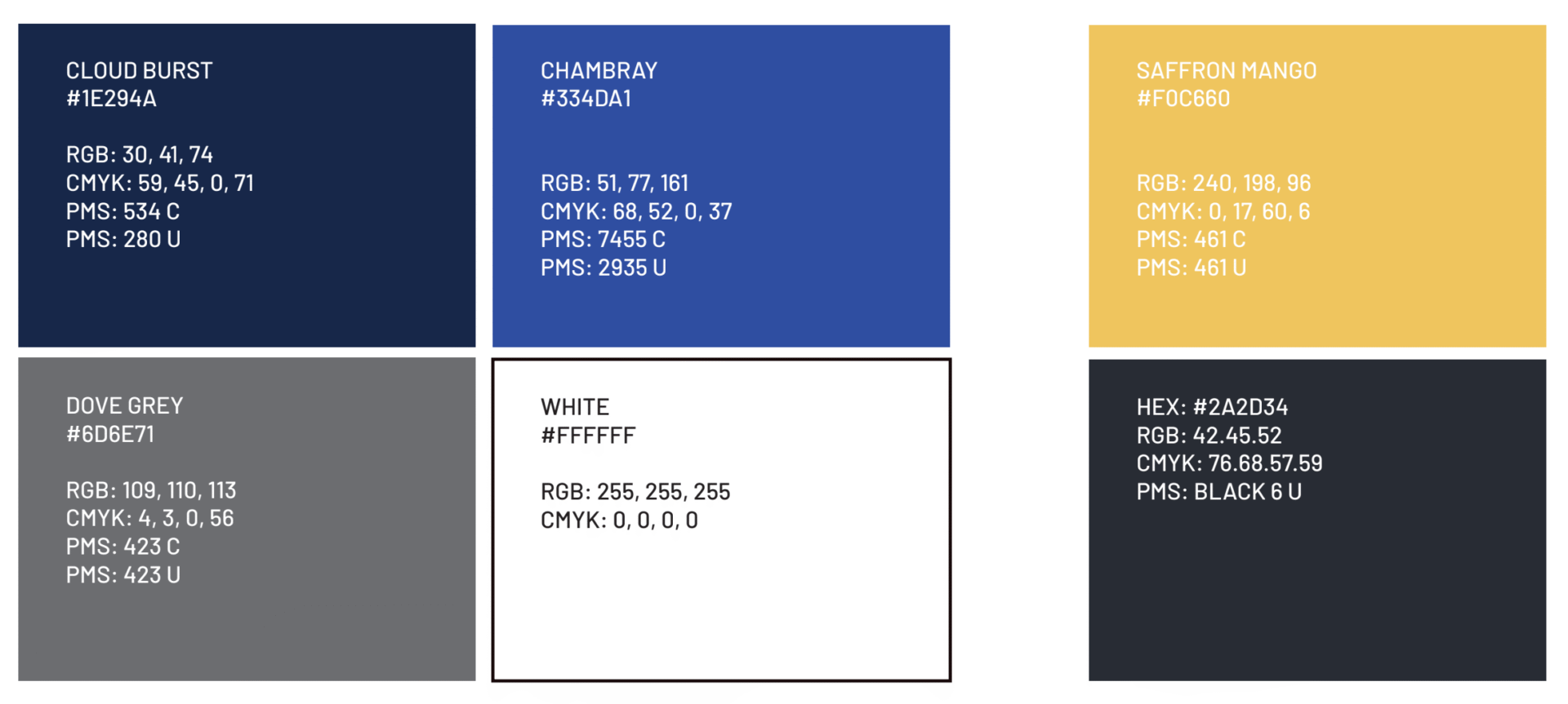
Our brand colors represent our steadfast support and trustworthiness from shades of blue. Our warm, earthy tones reflect the hard-working people we serve.
Color Usage
Below is a table outlining which colors to use for which applications. Please consult with your marketing department and production vendors if you are unsure of what file to supply or use.
| CMYK | RGB | Hex Color Codes | PMS (Pantone Matching System) |
|
|
|
|
Collateral
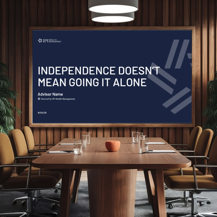
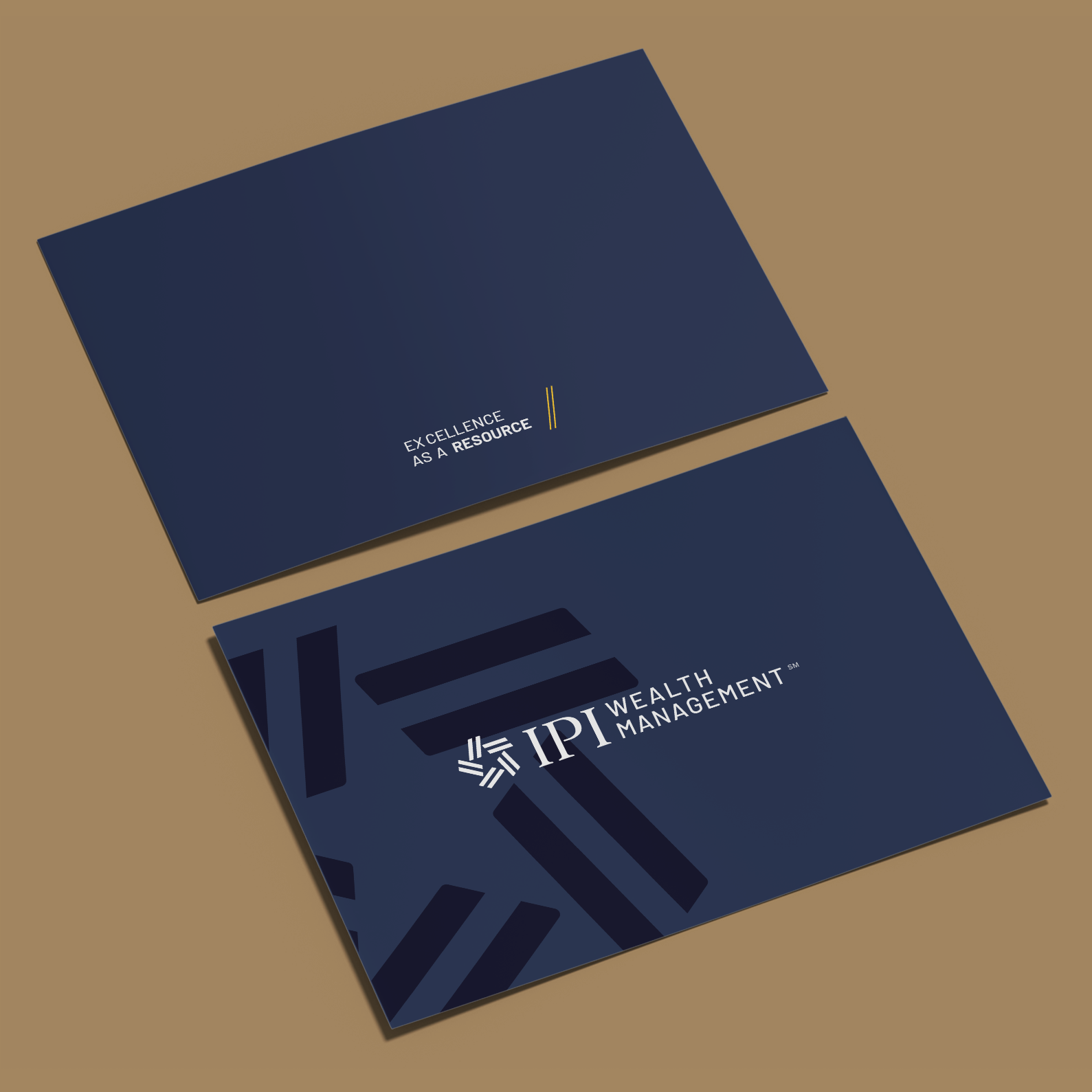
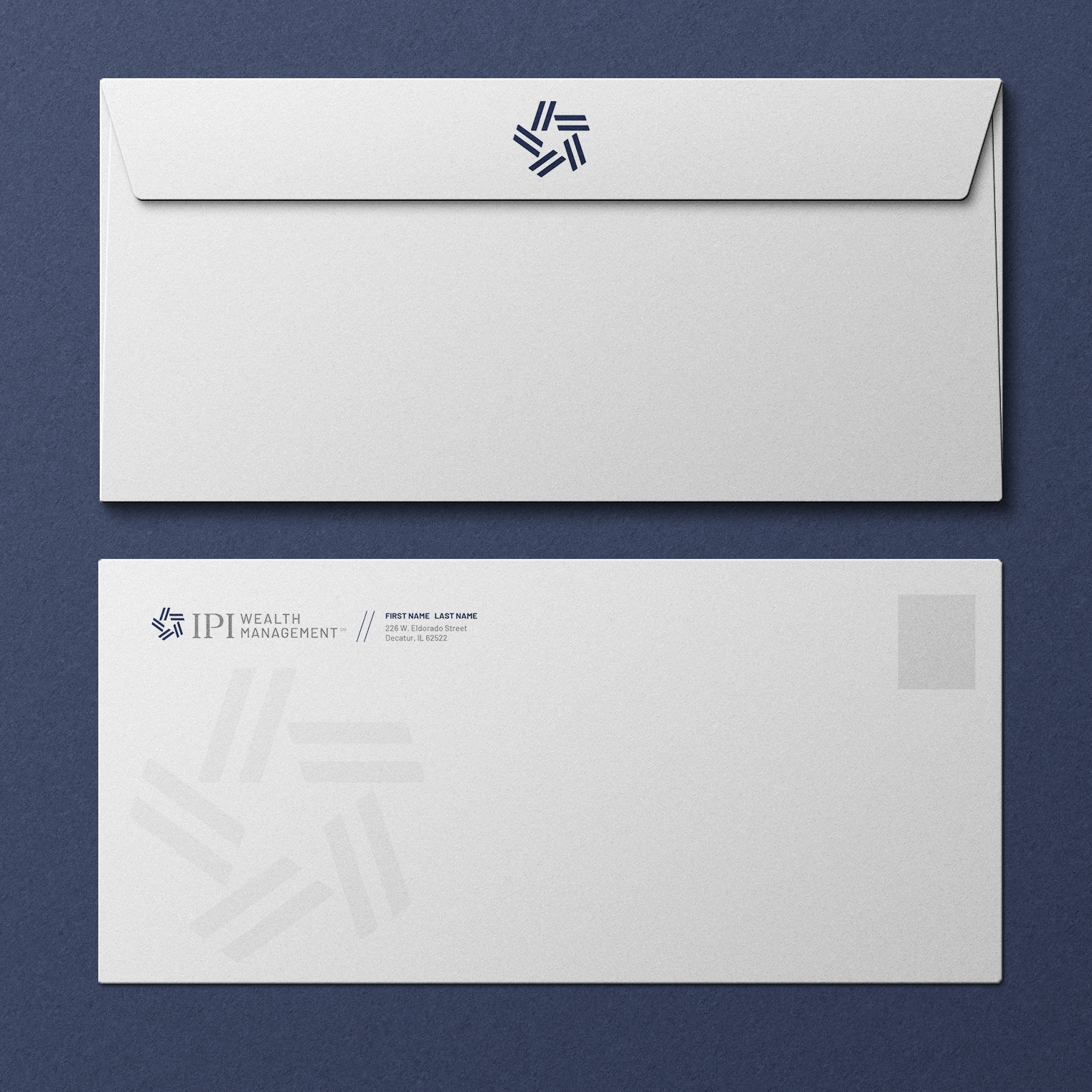
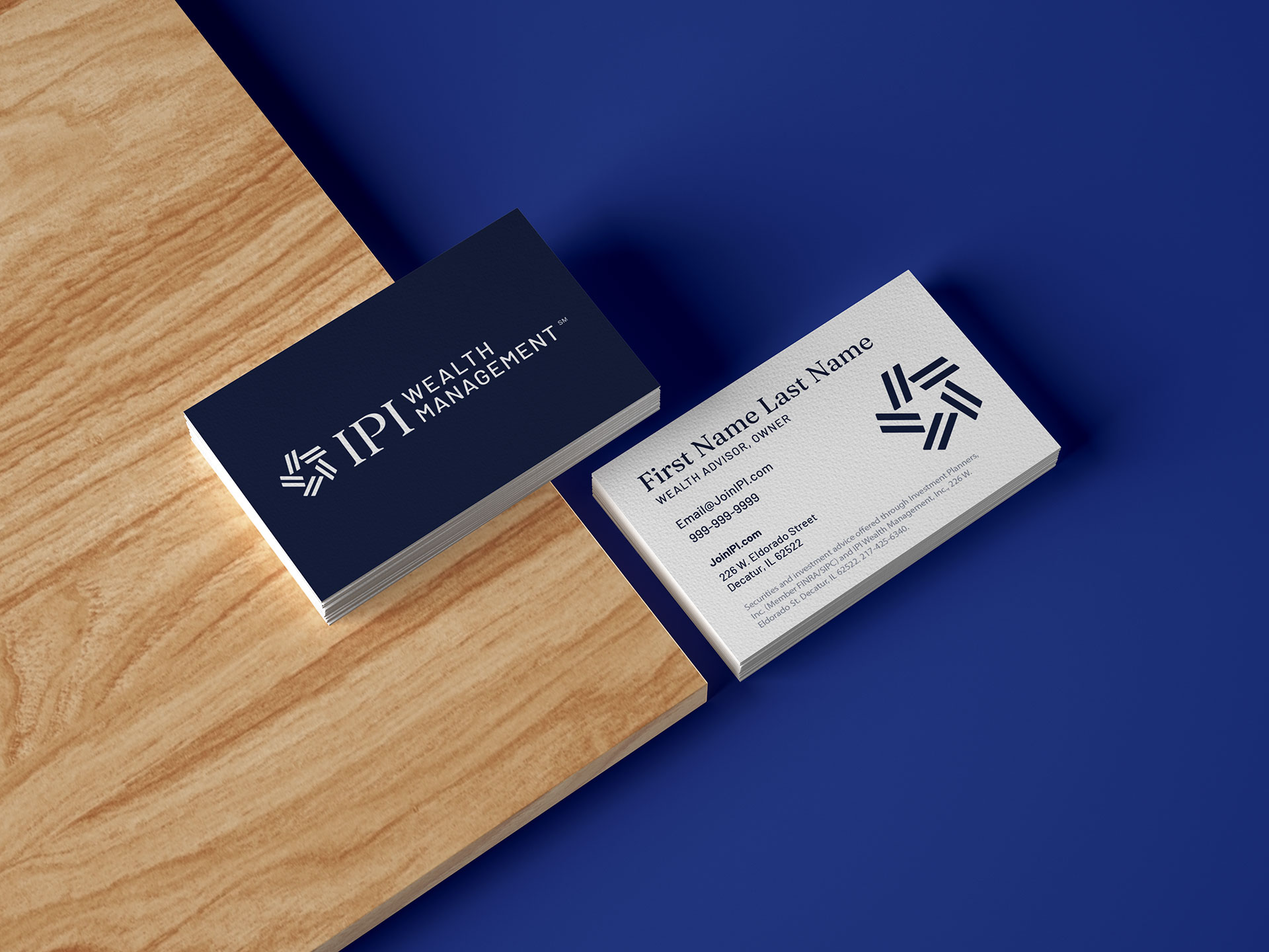
This section includes branded marketing materials, which have been made available for your use. Please reach out if you have any questions about how to use these files or if you would like to request any personalizations.